Arts Magazine, April 1970

Greta Garbo, and Monroe. Deitrich and DiMaggio. Marlon Brando, Jimmy Dean. On the cover of a magazine… Ahum, no. This blog will not do a one-eighty and focus on Madonnas’s lyrics. But as i’ve mentioned i, and the blog, will now try and turn the focus to magazines. I fully understand that this will not be an easy thing to do but as i’ve already said many times before i didn’t think the dust jackets would be easy either, and that turned out pretty good so i guess we’ll see that happens. Anyways, let’s get down to it! I figured since i’ve been away for so long i better come out with guns blazing, so it’s time for the big ol’ drumroll once again.. Coolness was promised, and coolness you shall have! And what can be cooler than something previsouly “unknown”? And by that i mean something that noone in my close little circle of Warhol-collecting-people had ever seen before. I’m sure a couple of collectors who don’t see the point in blogging about their finds have this on a shelf somewhere. Anyways, as it turns out it might not be entirely as unknown as i initially thought, but more on that later. It’s also NOT in Paul Maréchal’s excellent book Andy Warhol: The Complete Commissioned Magazine Work. That’s right, i called it excellent. This really is a FANTASTIC book and source of information, basically a must have for anyone interested in this area or whatever of Warhol’s work. I can’t say that i’ve read it cover to cover (yet) but a good thing is that unlike the case with the dust jackets where i had to try and find and put together bits of information here and there and, without sounding too pomposterous, try and write my own book i’ll now have the help of someone else who have already done all the legwork. It’s not all good though as i quite enjoyed playing detective but who knows, maybe i’ll still be able to dig up something of my own…

Hmmm… it really has been a long time since i last did this. I’ve been staring at the screen now for 30-something minutes trying to come up with something to write. Previously i think i’ve had a pretty good idea about where to go and what to try and get down and followed some kind of a map to get there, guess i’m a bit rusty… I think i usually start with WHAT it is but why not start with the WHERE this time. As with my previous “new discovery” – The Strange Case of Lucile Cléry which Guy Minnebach tipped me of about i can’t take any credit for finding this thing either. That part should instead go to Aaron Cohen who runs the excellent webshop/site kind of thing Projectobject. If i remember correctlt he got this from ebay which is quite amazing, i don’t think i’ve ever found anything like this on there that passed totally under the radar. I think this was also the case with the previously mentioned book that Guy found, very surprising… I’ve come to know Aaron a little bit since i seem to always end up at his site sooner or later during my Google-image-searching-extravaganzas… Anyways, he pretty much always has some really cool Warhol related stuff like book/dust jackets and magazines for sale and you can check out some of it here, personally i’ve always thought the Art Cash is cool and the Man on the Moon playbill looks really great. But i’m all about magazines nowadays so, those will have to wait… Anyways, this whole thing started out back in August when Aaron emailed me and asked if i had seen the latest sale of a yellow MTV on ebay and then he kind of casually mentioned something like “oh, and check out these magazines that i found…” and attached were images of the Stern Magazine/John Lennon cover that i had seen before but there was also another one that i hadn’t seen. I wasn’t entirely sure though, as i mentioned i haven’t read Maréchal’s book like some people read the bible so i figured maybe it was still in there somewhere, but i have also gotten a list of magazine covers from Guy Minnebach and i was at least certain that this one was not on that list. But one never knows with these things, i guess hypothetically it could be a known cover and even though Warhol is clearly credited on the cover there could still be some reason for it not to be considered a Warhol after all. Whatever the case i didn’t want to waste any time trying to figure that out so when Aaron said he still had it available for sale and when i saw that he had put it on his site i of course panicked as usual and felt i had to jump on it and so i told him i would gladly buy it. I think i ended up paying $100-115 or something like that which i think was a great and very generous deal. We’ve wheeled and dealed and traded a few times before this and it’s always a pleasure. So again, thanks so much for this Aaron!

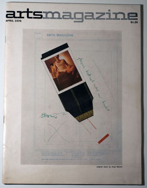
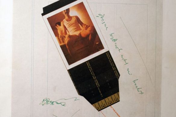
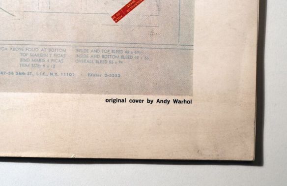
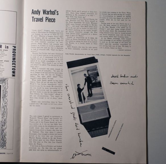
That about sums up the “where” and leads us down the natural path of the “what”… So, what is this thing. And… well, besides the obvious that it’s a magazine it’s more specifically a copy of a magazine called Arts Magazine from April of 1970. I’ve not been able to find a great deal of information about the magazine itself but there is a Wikipedia page and it seems it was published under various namnes – The Art Digest, Arts and finally Arts Magazine, from 1926 up until 1992. I haven’t made an effort to try and find out when the name changes were done because, well… it really doesn’t matter. On the cover is a collage with a polaroid photo of Gregory Battcock with the black jacket still attached together with some scribblings that i can’t really make out… The best i can do is “Gregory Battcock with something something”… is the last word “bucky”? If so then i have no idea what that means… I guess it’s not all that important anyway. I can’t say i’ve been able to find anything else really useful when it comes to cover design, but there is some information on the title page. There’s an image of it below but i’ll still do a little copy/pasting just for the hell of it.

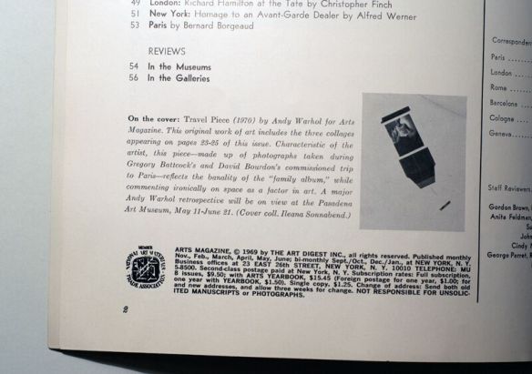
On the cover: Travel Piece (1970) by Andy Warhol for Arts Magazine. This original work of art includes the three collages appearing on pages 23-25 of this issue. Characteristic of the artist, this piece-made up of photographs taken during Gregory Battcock’s and David Bourdon’s commissioned trip to Paris – reflects the banality of the “family album,” while commenting ironically on space as a factor in art. A major Andy Warhol retrospective will be on view at the Pasadena Art Museum, May 11 – June 21. (Cover coll. Ileana Sonnabend).

Actually pretty informative… And naturally this posted the question of, at least to me it did, who the hell are these people. Gregory Battcock? David Bourdon? Ileana Sonnabend? I have never heard of any of them. I now realize that i probably should have at least recognized the name David Bourdon since he is the author of the, from what i understand, highly renowned biography book Warhol. Perhaps a bit embarrassing i guess… but to rectify this i’ve made a mental note that i need to get that book, get and also read. But let’s start with Gregory Battcock (got to love that name), i have no intention to turn this into a huge biography so i’ll try and keep it short and sweet and stick to what’s relevant here. From what i understand he was basically an artist, art historian, art critic and a prominent figure of the New York art scene in the 60’s and 70’s. And i guess anyone who ticks all of those boxes around that time would end up crossing paths with Andy Warhol sooner or later. I guess they eventually became good friends and Battcock ended up starred in three of Warhol’s films – Batman Dracula, Horse and Eating Too Fast. I’ve also picked up that he became a special correspondent for Arts Magazine in 1967 and from there he would eventually go on to serve as editor of the same magazine in 1973. Sadly he ended up being brutally murdered on christmas eve in 1980 in his appartment in Puerto Rico and from what i can tell the murder remains unsolved. For those wanting to know more about this guy i can recommend this site which is the one where i stole most of this “knowledge” from. Some other guy namned Joseph Grigely apparently found the collected estate of Gregory Battcock abandoned in a warehouse in 1992 and there has been exhibitions of this stuff as late as the previous summer. There is also some information on Waholstars here and here. There was also a book titled Oceans of Love: The Uncontainable Gregory Battcock published back in August so it seems he’s all the rage at the moment… That’s enough about him, maybe “he was friends with Warhol” would have done just fine…

On to David Bourdon and from what i can tell the story is pretty much the same… for some reason there is only a german Wikipedia page but thanks to Google translate i can tell you that he was a journalist, art critic and author who, like Battcock was a prominent person in the art scene of the 60-70’s and therefore of course also became close with Warhol. I think he also had some kind of role in Batman Dracula, i haven’t seen the film myself but i’m guessing it was a smaller kind of role. There is a pretty good biography thing here but i’ll sum it up like this, the guy wrote and worked for a lot of magazines – Village Voice, Life, Smithsonian Magazine, Vogue, GEO and Art in America. He was also president of the US branch or whatever they call it of The International Association of Art Critics. Seems he was also involved in some capacity in some Factory projects, for example the 1963 series of Elvis Presley silk screens. It feels like i’m just trowing out irrelevant links left and right but i found this interview with Bourdon pretty intersting. So yeah… again this all boils down to that he was friends with Andy Warhol.

Last but not least, Ileana Sonnabend… She actually has a Wikipedia page so that makes things a little bit easier. She is also perhaps the least important in this mess of a soup so i’ll not dive in too deep but i have to go from her and end up at Warhol one way or another so let’s see… For a number of years she was married to a guy whose name i actually recognized, and that guy was Leo Castelli. Even though i knew the name i can’t say i knew much more, but basically he was a big shot art dealer whose gallery showcased the work of people like Robert Rauschenberg, Jasper Johns, Roy Lichtenstein and of course also Andy Warhol. I’m guessing he and Warhol ended up as close friends and in, if i’m not mistaken, 1965 Warhol made a silkscreen of him in his jacket and tie. Oh well, that’s enough about him, Back to Ileana… in 1962 she opened her own gallery called The Sonnabend Gallery in Paris and from what i can tell this was a pretty bid deal and instrumental in making American art of the 1960s known in Europe. I’ve also read that Sonnabend was an early and enthusiastic supporter of Warhol and presented three important exhibitions of his work at her gallery in Paris – Death and Disasters (1964), Flowers (1965), and Thirteen Most Wanted Men (1967). I’m pretty sure that is was during this show in Paris in 1965 where Warhol made the famous announcement that he was retiring from painting to focus on filmmaking. Also not important here, sorry… Once again we end up with the conclusion that yeah, Sonnabend was good friends with Warhol. And thus the circle is complete. These three people that i had never heard of knew Andy Warhol. How very fantastic, exciting and wonderful all at once!

Soooooooo… maybe i should have just stayed with what is written on the title page. In short, Warhol sent Gregory Battcock and David Bourdon to Paris to snap some photographs. But what i’ve been trying to get to with all this are the four words at the end there – “(Cover coll. Ileana Sonnabend).” What does this mean? Is Sonnabend credited with the collage but then Warhol is still given credit for the actual cover, is that a common thing? Or is the cover supposed to be seen as a part of the “original work of art titled Travel Piece” that is the three page collage IN the actual magazine, and therefore credited to Andy Warhol? I have no idea. Like i said i don’t really know how these things work but i find it somewhat, well…unclear. Whatever the case and i won’t dwell on that anymore, this is a magazine with a cover that is clearly credited to Andy Warhol on the actual cover and it’s NOT in Maréchal’s book, whoohoooo! Pretty freaking cool!

However, as i mentioned at the beginning it might not be as unknown as i thought. I’ve been “researching” the cover here and there for a couple of weeks and the only thing i could dig up was this old archived story from the magazine Artforum International. I’m not sure when this article was published but my guess is that it was done so in the September 2012 issue, and that guess is based on another one of these archive sites, more specifically this one. You can’t read the full article without a subscription but luckily the interesting part is right at the top…

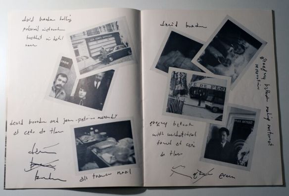
“IN APRIL 1970, Gregory Battcock appeared in his underwear on the cover of Arts Magazine, the publication he would briefly lead as editor some three years later. Like “Andy Warhol’s Travel Piece,” the three-page spread it announces, the cover’s design, credited to Warhol, looks unfinished. Battcock is pictured in a Polaroid photo, its black jacket still attached, which has fallen at an informal angle on the gridded layout form used for the magazine’s pasteup. In the midst of this arch disarray, the critic–a notoriously handsome, sexually voracious bon vivant who was particularly fond of travel (on ocean liners if possible)–perfectly occupies the position of gay icon. He wears white briefs and a sleeveless T-shirt and is seated with his legs splayed, sexy mustache dominating what’s visible of his backlit face (cut off, in the photograph, just above his eyes). Here we have the writer as malleable object, sponsored by Warhol to travel to Paris with fellow critic and intimate David Bourdon for the express purpose of producing a project for the magazine (though without any explicit agenda for their stay).”

So i guess the avid reader of Artforum International would have been given the heads up about the covers existence a couple of years ago. Too bad i don’t read any art magazines, maybe i should start….

If perhaps not shocking it was at least a little surprising to find that article and i’m always happy when i find stuff like that. If nothing else if gives me a couple of lines of text to fill out an otherwise boring post with… So far all was well and good. But then last night i was flipping through the actual magazine to see if there was some other intersting mentions of something in it. I didn’t find anything like that but for some reason i had missed that the title page called the work “Travel Piece” so i then i did a quick google search for that and something else and what Google threw back at me was at least more shocking than surprising this time. Turns out a copy of this magazine was up for auction just a couple of weeks ago! That one is a lot cooler than mine though since it’s also signed… and one of the previous owners, Börje Bengtsson, who coincidentally is Swedish and apparently runs a gallery in Landskrona claims it’s the only signed copy he has ever seen. I have no idea who this guy is either but if one is to believe the information in the listing he is “a leading world-wide dealer in Warhol material for over 30 years”… maybe i should contact him and see if he has some other magazines for sale. It also states the obvious that “Edition unknown, few survive”, and i guess one can’t argue with that. Even though i’m new to the whole magazine-scene i’m still surprised that you see them on ebay now and then. I’ve tried to get information from the publishers of the books regarding the sizes of print runs but so far not a single company has been able to provide this. And considering how rare many of the books are i would imagine that ever fewer of the magazines survived… So it will be steep hill to clilmb for sure.

There it is. My first post about a magazine and the beginning of a new quest. And finally i get to remove that “coming soon” thing from the magazine menu and actually put something there… I have high hopes for a fun ride and i’ve already picked up six or seven of them i believe so there’s more stuff coming up!

arts-magazine-warhol-cover-1

arts-magazine-warhol-cover-2

arts-magazine-warhol-cover-3

arts-magazine-warhol-cover-4

arts-magazine-warhol-cover-5

arts-magazine-warhol-cover-6

The Butterfly Tree – Robert E. Bell (Lippincott, 1959)

Time is slowly working it’s way towards the end of the year and i really need to get a move on if i want to cover all the years finds before it’s time for the usual yearly summary kind of thing. But my oh my… How and where to start with this? I actually went old school yesterday and sat down with a good old pen and paper trying to piece together the timeline or whatever going from the knowledge of it’s existence to the successful acquisition. I’m not sure it made me any wiser though, there have been so many twists and turns and crazy attempts and endeavors involved in trying to get a hold of this book that it’s hard to remember them all. But i’ll do my best…

I’ve probably mentioned this a couple of times already but when i started my collection of dust jackets what i had in front of me was basically a blank piece of paper. But luckily a couple of people had already done the legwork so i didn’t have to go and completely invent the wheel from scratch. I also think i’ve already mentioned these sources more than once but they are certainly worthy of yet another mention and in the beginning my bibles were the two acticles in Rare Books Digest and Polari Magazine. Even though these are an excellent starting point none of them (not even when combined) are complete and for example the book of interest here is not mentioned in either of the articles. So how did i learn this book existed? Well, i’m pretty sure this is another thing i’ve already mentioned before but (as usual) i owe a great deal of thanks to Guy Minnebach and his extensive lists of books and magazines. So i guess that completed phase one – i knew the book existed. But i still didn’t know what the cover looked like as searches for anything relating to the title, publisher or author didn’t bring up anything useful at all. Luckily Guy sent me some images later on, not that this brought me any closer to finding it but then i at least knew what to look for, both in words and image so to speak…

Had i been a less patient and/or wealthier man this whole thing could have been over in a lot less time than two-something-years. Early on i found the book on Amazon for $500 or something like that and i’m pretty sure but not entirely sure that the same copy is still on there now. The few but avid readers of this blog will have learned by now that prices like that are generally of little interest to me even though i’ve been forced to change my ways a little bit as time have moved on. At the time i didn’t pay much attention to this listing though, if it is in fact the same one as back then i did manage to get the price down by $50 or so but it was still nothing nothing that was ever going to happen. So as with a lot of other books i was forced to play the extremely boring and tedious waiting game.However, there was this one thing that surfaced in connection with this book that actually called for action instead of just waiting, and that thing was a book titled Meet Me at the Butterfly Tree written by Mary Lois Timbes Adshead. As i was going along with my daily and obsessive image searching this book kept popping up and eventually i also noticed that Robert E. Bell was actually noted as the (co-)author on this book as well. Once i finally got that fact in my thick head i put two and two together and figured that Mary Lois obviously must have known Robert E. Bell in one way or another. Luckily she had a couple of blogs and i was able to get a hold of her email adress and sent out a shot in the dark email with questions and whatnot, of course i was hoping that she would have a whole box of old and prestine butterflies lying around and that i would be able to pick up a cheap copy. Unfortunately she didn’t. But what followed was a fantastic and nowadays very rarely seen commitment and effort on her part in trying to help me in this quest. She has really gone out of her way with this thing, asking friends, and friends of friends, checking used book stores and asking the owners to keep an eye out and if i remember correct even trying to contact Bell’s brother… Quite remarkable to put in such an effort for someone you don’t know in any other way than as a name in an email. Even though she was unable to track the book down for me i am forever grateful for these efforts, thank you so much!

It was also by advice from Mary Lois that i found the newspaper The Fairhope Courier. The word “Fairhope” comes up a lot when it comes to this book and maybe i should have gone into it a little bit more earlier but it’s really not THAT important. Anyways, at first i had no idea what is was. Was it a place or just some… thing? I’ve now learned that it is in fact a city in Alabama and to keep the biography thing short and sweet this is where Robert E. Bell spent his summers as a child and as far as i know also where he lived for a time later on in life. Most importantly it’s also the city on which the fictual town of Moss Bayou in his book is based upon. For some reason i got the idea that the book would have been sold primarily in Alabama and the surrounding states. I’m not really sure why i got this idea but i figured that since it was far from a bestseller it would have generated the most buzz and most interest among local people, thus making local book stores a good bet for finding a used copy. Turns out this wasn’t the case, i got a few replies from people saying they had it but all of these were for the reprint published by University Alabama Press.

Anyways, back to the Fairhope Courier… I had already played around with the idea of placing an ad in some local newspaper based on the assumption that the book is quite old and most people who in 2015 read newspapers made of actual paper are also… well, old people. I never did anything with this idea though, seemed like to much hassle to place and pay for an ad from halfway around the world. But then this site/magazine came along and all of a sudden the whole thing seemed much easier. After a couple of emails back and forth i ended up with an ad placed on the site,  this was sometime back in January/February and i also posted about this endeavour in this old post. I can’t say i expected much from this but as always i figured it couldn’t hurt. What i didn’t count on though was to immediately get sabotaged from beyond the grave. In a matter of days after my post Andy Warhol himself made a comment on the ad post asking “Is that the copy that has a dust jacket drawn by Andy Warhol and is extremely rare?”.

fairhope-courier-comment

Maybe i’ve been incredibly lucky but everyone i’ve ever come in contact with since i started my collections have been nothing but helpful, friendly and very forthcoming. So i guess this thing and this guy is the exception that confirms the rule… This is the kind of douchebag who before class in 7th grade would go and tell the teacher i just spent resess copying some other guys math homework. No personal benefit to be gained, just something done to sabotage another person. I can’t say i lost much sleep over this though. But i must assume this guy will be reading this post as well. So to whoever you are i just want to say that i hope you never find the book. Never. Ever. Ever… Ever.

Moving on… to sum up all the crazy adventures i guess i have to mention this attempt at contacting some journalist who interviewed a guy who mentioned the book. Crazy and fruitless indeed…There has also been a similar thing with some guy who mentioned the book in some blog post, needless to say this didn’t amount to anything either. Phew… i think that pretty much covers all the failed attempts so it’s time to get to the good stuff and the happy ending. Subconsciously i’m still working on my post about trying to “rare rank” the dust jackets and i’ll get around to it sooner or later and without a doubt this will be in the top five, at least. Besides the one, or perhaps two, copies that i’ve seen on Amazon this has been a rare sight. Almost rare enough to start coming to terms with the idea of never finding it. But i’ve come to learn that things have a funny way of working out, eventually… As said i placed my ad and contacted all the book stores in late january or early February. I can’t remember the exact dates and things when it comes to what happened after that, but luckily most sites store your message history. And what happened next took place on Etsy. I’ve refreshed my memory with the help of said message history and on March 10 i sent my first message about a newly listed item… I can’t find the first listing now and i might be mistaken but i think it was originally priced at $400 or thereabouts. And what followed was a number of attempts of haggling but seeing as the book was just put on the site the seller, understandably, wanted to wait and see what happened and not just jump on the first idiot who offered just short of half the asking price.

At this point i was missing more than a couple of the books, had this been the only hole to fill i most definately would have jumped on the opportunity even with it’s original price tag. But as it happened i decided to wait, i kept checking the site now and then up until the start of the summer and the book was always still available. Then sometime in June i went to have a look and to my surprise it wasn’t there. After the initial depression had worn off i sent more than a couple of messages to the seller asking if it was still available or if it had been sold. In the couple of months since i first noticed it i had picked up some of the other books i needed to find so at this point i was only missing one or two and i was just about to contact the seller and make a resonable offer. Unfortunately this was right in the middle of us selling our apartment and getting everything in order with the new house and for some reason i was incredibly stressed out by all this and figured i would wait until everything had settled down. So naturally i was terrified and kicking myself over potentially blowing what in my head was a once in a lifetime opportunity. Turns out the world hadn’t come to end though. Apparently you need to renew your listings on Etsy after a certain amount of time, something the seller had forgotten to do so the book was still available and to cut to the chase we settled on a price of $275 which i was very pleased with, and as i recall the price was suggested by the seller so i must assume she was pleased with the deal as well. All said and done and the book went back online, and i even got a special listing reserved just for me…

etsy-1

It took a while before i got my hands on it though. The seller was kind enough to order protective mylar which took a while to get sorted out and then i also shipped it to Frank Edwards where it stayed and got some rest before finally ending up with me. So… there it is. That’s the (short but still way to long) full story about how a lot of failures eventually turned into something with a very happy ending. Regardless of how frustrating and annoying the chase for some of these things can be it’s journeys like these that are the most rewarding and most fun to look back on once you get to the finish line. I’ve had a lot of fun chasing this book and together with the Giant Size $1,57 cassette and booklet  it’s really one of the highlights of my entire “collecting career”. One of the reasons this post has been somewhat delayed is that i had a million questions for the seller that i was hoping to get the answers to. Well, maybe not a million questions but i was very curious about when and where she found it and also what it was that attracted her to the book. Did she notice Warhol’s credit on the cover or did she just like the cover design and by chance happen to pick it up for a couple of dollars and see the credit later on? I’ve asked her repeatedly but so far i haven’t heard back. Things and information like this are perhaps mainly of interest to me personally but i still enjoy to know and to be able to add stuff like that to a post. If i ever get an answer i’ll get back with an update. One funny thing she did tell me though was that i wasn’t the only one who contacted her when the book went AWOL, apparently there were more than a few people who did so who all (like me) had been waiting for the price to be lowered. I guess that sometimes it pays off to be the annoying stalker sending messages left and right and all of the time…

The last couple of months have been exciting times on ebay when it comes to Warhol’s dust jackets, but i’ll get to the details of that in a later post. Anyways, this book made it’s first appearance on ebay (at least that i know of) about two months ago and ended up selling for $230. I have no intention to pat myself on the back to much but i think my copy is in better condition than this one so i’m still very happy with what i ended up paying. And i couldn’t have bought this one anyways since there was something else ending at about the same time that i just had to get. But again, more on that later… Hopefully one of those who missed out on my copy was able to get this copy instead. For those still on the prowl who also have deep pockets i can recommend this listing for a signed and very nice looking copy, the price tag isn’t as nice though.

This post has gone on for way to long already, but there are still a couple of things i want to get to so bear with me. Unlike some of the other authors who’s biggest claim to fame ended up being that they had a book published that had a dust jacket designed by Andy Warhol and where it’s basically impossible to find any information about them things are are a little bit different with Robert E. Bell. That said he’s still no Dickens or Hemingway but there are more than a couple of sites with good information and biographies. I’ve also learned a little bit from my emails with Mary Lois. I don’t intend to go on copy/paste spree, anyone interested can go read up on any of the sites at The University of South Alabama, The Alabama Literary Map or at the Encyclopedia of Alabama, all of these are great resources. I think it’s safe to say that he had a passion for writing, reading and books in general since he, from what i understand, spent the better part of his life holding various positions within the “literary society” or whatever one might call it. He held various positions at different libraries, was the director of The Book Club of California and opened book stores in both New Orleans and San Francisco. And in the midst of all this he still found time to write and publish a number of books where the most noted one just happens to be The Butterfly Tree. I can’t say i’m confident enough to claim i know exactly how many books he published, but after a couple of laps around Amazon i keep ending up with the same number of titles and besides the two already mentioned my guesstimate would be there are (at least) four more books. The first book he published was in 1956 and was titled A Bibliography of Mobile, Alabama. It seemed he also developt a love for classical mythology and apparently he published three award-winning reference books on the subject titled A Dictionary of Classical Mythology: Symbols, Attributes, and Associations, Place-Names in Classical Mythology: A Biographical Dictionary and Women of Classical Mythology: A Biographical Dictionary. Finally, and this might be considered overkill, but amazingly his dissertation from Berkeley titled History of the Grabhorn Press is also available on Amazon. Images of some of these titles are available online and i’ve also seen the others and i can say that none of them have covers by the hand of Warhol. Not that i was expecting that…

However, and this is a big HOWEVER. There are at least four alternative covers for this book that the world has yet see, and in all probability they will remain a mystery forever and ever. As i recall this was first noted by Guy Minnebach and to get to the how and where we need to once again return to the “sister book” Meet Me at the Butterfly Tree. I now have a copy of this book, not only is it a great read but it also uses the same tree design done by Warhol as the original book so if you’re not interested in the book for the sake of reading it i would still get it for that little cover design detail alone. Anywhooo… as said Guy was a little more creative and a lot smarter than me since he used the “Look inside” feature on Amazon and in Bell’s first letter to Mary Lois he mentions that he has five original drawings made for the cover, pretty freaking cool! Naturally this started another quest but nothing of value has surfaced so far… But i would looooove to see these one day, but yeah… i doubt they will ever see the light of day.

letter_1

Where they might be? Well, of course i have no idea but had i been able to i know where the first place i would look would be. Robert Bell passed away in 1999 and if i remember correct it was Mary Lois who first told me that after his death, or perhaps even after the death of his partner Mark Hanrahan in 2009, most/all of his work was donated to The University of South Alabama and that it’s now archived there and the details of this can be found here. I’ve come across similar things like this before, for example the New Directions archives or whatever, and interestingly there are also mentions of Warhol in these “Robert Bell Papers”. More specifically there are entrys/postings/whatever like “Correspondence re: Warhol Collection, 1989 – 92, 1996”, Retrospective: Andy Warhol by Heiner Bastian and Andy Warhol Stamps, Ebay Info”. The one in the middle is this book and apparently Bell was also an avid stamp collector and there is an image of the commemorative Warhol stamps among other Bell related items from an old exhibition here. So that just leaves us with the first one… i guess this could also be something relating to a book or something? Whatever the case i doubt the drawings are hidden in that material, but who knows. Lately i’ve not had the energy or time to embark on some new looney adventure but i’m sure this will change soon enough and then stuff like this and the New Directions archives thingy are all highly possible projects. I would assume The University of South Alabama got the bulk of Bell’s work but it seems parts of it also ended up at the Fort Worth Public Library in Texas. The details of the material kept there are less extensive and the only things that are mentioned are “a scrapbook, a novel, and some biographical information”.

Time to wrap things up… and why not begin to end with a funny little thing. I haven’t read more than a couple of pages of the book but someone who did read the whole thing and who also seemed to have enjoyed every word of it was Harper Lee, author of the Pulitzer Prize winning novel To Kill a Mockingbird. Apparently The Morgan Library in NYC (i think) at one point displayed a collection on things relating to Harper Lee and among these were some letters from her sent to Robert Bell, images of these can be found here. There are some funny lines in there, especially the way she starts the letter and her anger towards Lippincott (who was also the publisher of her book) is also pretty funny. There is also another, less angry, letter found among one of the images here which yet again praises Bell’s book, maybe i should actually get around to reading this one. And while on the topic of Lippincott… this is the second book by that publisher with a Warhol jacket, the other one being The Madhouse in Washington Square which was published the year before in 1958. Both also follow the same concept with a drawing on the front and a photograph of the author on the back. I’ve of course googled this photograper, Squire Haskins, as well. Besides learning that his real/full name was Lewis Benjamin Haskins, Jr and that the company he once founded is still up and running today i didn’t find anything usefull or interesting. I do however love the fact and little detail that Bell is holding a cigarette in the photograph, i’ve always enjoyed how people smoked ALL THE TIME and EVERYWHERE in the 50’s and 60’s. Must have been good times…

Oh yeah, what about the book itself. Even though i didn’t get the information i had hoped for from the seller i can still use my eyes and tell that it’s an old library book. And taking that into consideration i must say it’s in absolute spectacular condition. It’s definately one of the best looking ones in my collection, which is quite nice since it’s also one of my favourite jackets. As said it was also one that i was starting to doub’t i would ever get to put on the shelf. And that would probably also have been the case had i not been willing to up my budget a little bit, it’s funny how you somehow and magically get more money to spend as the holes in ones collection gets fewer and fewer… Oh, i’ve also tried to contact Lippincott (which is now Wolters Kluwer as far as i understand) to try and find out how of many of these books that were printed, but as usual i’ve not heard anything back. I just noticed that apparently Wolters Kluwer also owns Swedish publisher Liber, maybe i could try taking a detour via them… Whatever the number of printed books may be i’m still extremely happy that i managed to find one of them and it’s great to finally get to write the post i thought would never be.

the-butterfly-tree-warhol-1 the-butterfly-tree-warhol-2 the-butterfly-tree-warhol-3 the-butterfly-tree-warhol-4

Tchaikovsky / Erica Morini – Violin Concerto

I don’t really know how to start this post. For a while i was thinking about starting with the famous misquote that is usually credited to Adolf Hitler stating that “If you tell a big enough lie and tell it frequently enough, it will be believed”, or something along those lines… But i don’t know, that might be a tad overdramatic. So let’s start with some basic facts and we’ll get to the sorting out of the legitimacy of this being a Warhol cover later on, at least my thoughts about it… This is a recording of Tchaikovsky’s Violin Concerto performed by the Chicago Symphony Orchestra and with Erica Morini as lead violinist or whatever. The music was written by Tchaikovsky in 1878 and is apparently considered one of the most technically difficult works for the violin, so kudos to Morini for doing such a great job… It was released on the RCA Victor label sometime in the late 50’s, in a couple of the listings i’ve seen the year being put down as 195? and in his book Maréchal has is down as “about 1957”. And this seems about right. When i started “researching” this cover i thought it would be possible to narrow it down to sometime in the late 50’s and more exactly sometime during or after 1957. Why? Well, when it comes to this record you pretty much have mention the Rhapsody in Blue / Grand Canyon Suite album as well as these are intertwined in more ways than one. But for starters the Gershwin album was released in 1957 with the catalogue number LBC-1045 and the Violin Concerto is very close to this having been given the catalogue number LBC-1061. I don’t know exactly how these things work but to me this would at least imply that the Violin Concerto was released after the Rhapsody and of course before whatever album was released and catalogued as LBC-1062, and that record seems to be this one hereGlazunov’s From the Middle Ages. Unfortunately that record also appears to be undated or whatever but on most places it’s listed as 60’s… So, yeah… to say that the Violin Concerto was released sometime during 1957-1959 i would say is a pretty good assumption. At least that’s what i thought at first. As said i don’t know how these work really but looking at this page from an old copy of the magazine The Billboard there is a mention of Tchaikovsky’s The Swan Lake numbered with LBC-1064, and that magazine is from 1954… So i really have no idea what’s going on. It might have been wise to not try and date this and just stuck to the 195? thing… Let’s just say sometime in the 50’s!

Billboard

Onwards and upwards. I can’t remember the first time i was made aware of this cover but the first logged copy that i’ve been able to find is this one that was sold at the end of 2009 for $51 and had no mention of it being a “possible Warhol” in the description. Fast forward about six months and we see the first mention of “Warhol” in this listing, and then of course the selling price is doubled closing at $108. Since then things have never really spun totally out of control though. Not even after Frank Edwards wrote his post about it in 2012 you’ll see price skyrocket, so i think there has always been some kind of skepticism about the legitimacy of this cover. And i’ve been part of that crowd as well, and i still on the fence today. I won’t try and force an opinion either way down anybody’s throat but let’s just hang up all “pieces of evidence” side by side and see what they look like. And i’ll also give you my thoughts on what side of the scale everything should be placed… The one thing that packs the most punch is without a doubt that Matt Wrbican has actually signed off on the Rhapsody cover on his blog. And for what it’s worth the cover for the Violin Concerto has been up for discussion now and then in the WCCC and the general consensus is that the drawings on these two covers were made by the same artist. I also can’t argue with what Frank Edwards writes about the unlikelyness of RCA having two artists at the same time on the payroll using the same blotted line technique. So… seeing as some of the most knowledgeable people i know of on Warhol’s work would give this a pass i might be considered a huge idiot for not being totally convinced that this is the case. But i like it when things can be backed up and where something isn’t based entirely on what is basically an opinion. I keep thinking about a veeeeery funny clip in the movie Who the #$&% Is Jackson Pollock? where some expert gives nothing but praise to a modern art painting that the reporter then reveals was done by a 5 year old. And there are plenty more stuff like this, the whole thing about Pierre Brassau from my hometown is also extremely funny. Modern art is of course modern art and perhaps not entirely applicable here but, yeah…. i don’t know. I guess i enjoy hard and indisputable evidence. Anyways, i’m a bit tired today but these two covers are the only two (three if you want to include the cover for Porgy and Bess) i can think of right now that are either not signed nor possible to find similar style drawings and other documentation to validate Warhol’s hand in the design. Before the new and updated version of Maréchal’s book came out i was very curious to see if this would be included. And if it were to be included i was hoping that he would have found something to back it up. Well… the cover is included but sadly it doesn’t come with anything to support the case that this is by Warhol. At least not something that makes me convinced. He mostly just goes on and on about Erica Morini and her Stradivarius violin… He is even brave enough to claim that not only did Warhol do the drawing of the orchestra but that he is also responsible for the big violin. Personally the interesting part of this cover has always and only been the guys in the background jamming away, i’ve never considered the violin to be Warhol’s work… But as i’ve said many times before – what do i know and i would still score poorly in a “recognize-Warhol’s-style-contest”. And even though i am not (and probably never will be) absolutely 100% convinced that this is a true Warhol cover i of course accept that it is now certified or whatever… The thing that has kept me skeptical is that i really haven’t seen or been able to find other drawings by Warhol’s that are similar to these. I guess the guitar on the cover for the Madrigal records is somewhat similar in detail and so on, but i don’t know. It just doesn’t sit right with me… Anyways, i got this on ebay a couple of weeks ago on a second-offer-chance-thing and condition wise i’d say it’s pretty good. There’s the usual couple of smaller issues but all in all i can’t complain. As said this is now in Maréchal’s book and regardless of what opinion i or anyone else might have about the cover or the book it does carry a lot of weight for collectors and the inclusion does grant it the “Warhol cover stamp”.

My thoughts and feelings aside i still enjoy the discussions about covers like this a great deal, and you can really learn a lot but going back and forth and listening to what everyone has to say. That said it will not get a place on my wall, but it’s nice to have a copy tucked away just in case…

Violin-1 Violin-2

The Strange Case of Lucile Cléry – Joseph Shearing (Doubleday/Dolphin Mystery, 1963)

I’m going to try and set the mood for this. And i realize that since the title of the book is also the title of this post it’s perhaps not the easiest thing to try and build suspense and anticipation… But let’s try. In lack of a better song and even though it’s pretty overused or whatever go set this tune on repeat and then continue reading.

This is a pretty big deal for me. Why? Well, this will most likely be the closest i will ever get to post something “new” and previously unknown. It’s not entirely unknown though, but i’m pretty sure that to most people interested in this stuff (which seems to be an entire handful of people) it will be news in one way or another. This book is not mentioned anywhere in any of the articles and stuff which feature this area of Warhol’s work. It’s also not mentioned in the catalogue for the exhibition Reading Andy Warhol. It is however on display at the current show Warhol by the Book so to those that have been to see that great show i guess it’s not really news. My dream of finding something totally new will have to live on though because sadly this wasn’t my discovery. And i believe in giving credit where credit is due and as with a lot of other things i have to thank Guy Minnebach for giving me the heads up. As i recall he found it on ebay where it was listed together with the words “warhol cover” and eventually got it for chump change. At the time i was pretty amazed that i had missed it considering all the saved searches i keep but i guess one can’t keep track of everything all the time. Anyways, i was going through some old emails and oddly enough it’s pretty much exactly one year ago that i found out this book existed. I got an email from Guy about his find on 6/5-2014 and even though i found it about a month ago it wasn’t until a couple of days ago that i finally got to hold it in my hands. There are plenty of books that i have spent a lot of time looking for but nothing compares to the time spent on this one. I really have spent a HUUUUGE and almost unhealthy amount of time looking for it so to finally find it was almost a surreal experience and a pretty fantastic anniversary gift of sorts.

Where did i finally find it? Well… i wish there was a great and exiting story here but there really isn’t. One afternoon during one of my OCD checks of my wish list on Amazon it was just there… There are a couple of different editions of this book and as usual in these cases i thought that the seller has just incorrectly listed one of these other editions under the one i’ve been looking for. And even though it was listed under the Doubleday edition and had the correct cover image the image shown was an old one that i recognized all to well. This image was uploaded by some woman that i actually stalked and contacted more than six months ago only to find out that her copy had been sold as part of a big collection and that she had only uploaded the image for some reason. Anyways, after just a quick look and seeing as the description featured the word “Dolphin” it became obvious that this was actually the real deal and after a couple of skipped heartbeats followed by my usual fumbling and panacking with the phone i had placed the order. Since this has basically been my biggest unicorn to date i didn’t bother to waste time waiting for images and even though the description featured wording like “cover has bumping, scuffing and dust smudging… lightly tanned” and so on i pretty much had to take a chance and jump at the opportunity. I must say that a lot of sellers of these paperbacks are pretty conservative in their grading of the books. But i can’t complain, without a doubt this looks pretty damn good for a +50 year old paperback.

So… what do we have here? I guess this is pretty self-explanatory but the title of the book is The Strange Case of Lucile Cléry and it was written by Marjorie Bowen under the pseudonym Joseph Shearing. I did not know of this author before this but it seems she enjoyed writing quite a bit and also kept herself busy doing it considering her total output exceeds 150 volumes/titles or whatever… This was originally published as Forget-Me-Not in 1932 and as said there a couple of other editions among which the edition published by Pocketbooks in 1949 is the one that has pretty much always been the one i’ve been sent images of when asking sellers about copies listed without any mention of the edition or year and so on… Anyways, the edition that is of interest here was published in 1963 by Doubleday on the imprint/printer’s mark/colophon or whatever it’s called Dolphin/Dolphin Mystery. This will also not be the first time that i have to say that i don’t know anything about this design. But unlike a couple of other books where i’ve been able to piece things together i’ve not been able to find any information about this whatsoever, nor have i been able to find any similar style drawings by Andy Warhol so this is pretty cool. And once again i’ll also have to say that i would never ever not in a million years have looked at this book and thought that the drawing might have been done by Warhol.

I do know one thing though that is pretty interesting. And that thing is a guy named George Giusti and this might actually be worthy of a future and more detailed post but anyways… The credit on the back of this book states “Cover design by George Giusti, Cover drawing by Andy Warhol” which is exactly the same as on Manon Lescaut and The Red and the Black, both of which were also published by Doubleday/Dolphin. I haven’t found any good information on this George Giusti other than that he was inducted into the Art Directors Club Hall of Fame in 1979 and that if you image search him you will find a ton of stuff. I have no idea if there was any kind of business or creative relationship or whatever between Warhol and Giusti during this time but i would guess that Warhol was just asked to do a drawing for a cover and that Giusti was in charge of cover design at Doubleday at the time or something along those lines. It is pretty interesting though, and of course it’s far from a crazy thought that if there are three books, hey… there might be four. Or five. Or any number of others… For anyone getting the same thoughts i can save you a lot of time and effort by saying that i have already spent countless hours staring at images on Google. And i will most likely continue… Don’t take my word for it but there are no obvious others that i have found so far.

As always i need to say something about the condition and all things considered it’s pretty spectacular! There is some minor smudges and things like that but the binding is solid and not much else to mention. Naturally i would have settled for a copy in any kind of condition but to be fortunate enough to find one that’s in as great shape as this is pretty thrilling! And even though i’m still trying to do this thing on a tight budget i would have payed a lot for this book had it been necessary, so i’m almost embarrassed to say that it only cost me $11, poor seller… I don’t want to sound like more of a dork than i probably do but once i opened the package i held this in my hands like it was a newborn baby and just stared at it while my better half was doing an equal amount of staring at me asking what the hell it was that was such a big deal about a stupid book… But anyone into any kind of collecting can probably relate to the feeling of finally seeing that “holy grail item” sitting there on a shelf, and it’s a great feeling! But it also leaves you (or at least me) with a strange empty feeling. Even though i’ve not spent hours and hours straight looking for this i’ve still thought about this book every single day for almost a full year. And as with any race it’s of course extremely satisfying and a lot of fun to finally get to the finish line but at the same time it also leaves you with a feeling of “what now”? Luckily i do have two more books that i need to find. In a way i’m dreading the day when i have all of the dust jackets and might have start looking into starting collecting magazines… That will not be good for finances.

As said this is featured in the exhibition Warhol by the Book and Guy Minnebach had told me that it would be in the show before it opened and i saw this as both a good thing as well as a terribly bad thing. A good thing because it might raise awareness and finally make the book show up on various sites. And of course a terrible thing because this might also make prices rise to where i could not get a copy. The show has not been on for that long but so far it seems i was wrong about the awareness part but i’m really hoping that it helps raise interest in this area of Warhol’s work and that maybe more copies of this, and the other books as well, will become more available.

In conclusion – The unicorn has been caught! Now i just need to find the mermaid, dragon, phoenix or whatever i’ll decide to call the missing ones…

the-strange-case-of-lucile-clery-warhol-1
the-strange-case-of-lucile-clery-warhol-2
the-strange-case-of-lucile-clery-warhol-3

Lightning strikes again, and all turns yellow…

Once again there’s the feeling of déjà vu… I keep close to 50 saved search thingys on ebay and they say persistence is a fool’s best asset. For a while now this has almost made me show signs of being in the early stages of developing an OCD. I’ll check them when waking up in the middle of the night due to my daughter yelling or crying in my ear, first thing in the morning and then a couple of times during the day when there is nothing else to do. I’m not sure why i do this though. The chances that one morning there will be a The Nation’s Nightmare or something like that with a BIN of $50 are pretty slim. But i do it for the same reason people play the lottery or bet on horses i guess. And i regularly do both of those so… Anyways, now and then something happens that kind of makes it all feel worth while. And this morning was one of those times.

I don’t particularly like the cover to MTV’s High Priority and this is not the first time i’ve mentioned that. And things haven’t changed, it still feels sloppy, unpolished and unfinished to me. So all this considered it was basically at gunpoint that i decided to eventually get a copy. Then i believe it was Kevin Kinney from the WCCC who broke the news that there was also an “alternative” cover with a slight difference in coloring. I then got lucky at the end of 2013 when i found one of those yellow copies at a bargain price on ebay. I didn’t keep that cover for very long though as i sent it to Richard Forrest as a thank you for some nice mock-ups of The Nation’s Nightmare, Night Beat and some other things that he made for me. Time went on and i didn’t give this cover as much as a split second of my thoughts until it appeared again on ebay last summer. This time it was without a BIN and despite my thoughts and feelings about this cover i still thought i would buy it, if nothing else just to complete the set.

As i recall interest seemed low with not that many watchers and no real bidding was going on until the end. But oh my, when things started to happen there was a small explosion and it ended up selling for $444(!). I couldn’t believe my eyes and felt like the biggest moron on the planet who had just given away what was now apparently a pretty damn desirable album! Call it what you want but in my opinion words like crazy, ludicrous, ridiculous or insane comes to mind…

popsike

As i’ve said before i really don’t want to take any kind of credit for things when it comes to all this. Frank Edwards had posted about his copy long before i did and Richard Forrest also mentions the yellow variant on his list on Rateyourmusic. However there has been quite a few hits on the post i did about it so i don’t know… maybe i helped raise awareness a little bit. And if so that was pretty stupid in the end since i would never ever cough up close to $500 for this record. But it’s safe to say that in one way or another fellow collectors are now aware of this alternative cover. It’s even gotten to the point where sellers on discogs mention that it’s a “red version” in the description as you can see below. I guess they are fed up with what they feel are crazy and irrelevant questions about what color the stupid shading on the logo is. And i don’t blame them, but it’s pretty funny. It was also pretty funny to see what happened right after this copy was sold as a lot of sellers thought what they held in their hands was pure gold and you could see red versions listed for hundreds of dollars for a while…

discogs

Time to cut to the chase…. as is common practice i was checking my saved searches this morning and among many blue dots there was one next to the one for “mtv high priority lp”. Certainly not the first time this has happened and naturally it didn’t get me all super excited but once i saw what was there my fingers started fiddling all over the phone and i couldn’t click things fast enough… I think it’s a least a bit remarkable that this is now the second one of these i have gotten for a BIN of just $10. However, in all my haste i didn’t pay attention to the shipping cost which was three times the cost of the record, but oh well… you can’t win them all. I don’t know if i should be happy though, and i definitely don’t feel like i just won some kind of lottery. This is still a train wreck of an album cover to me. But at least i didn’t have to pay hundreds of dollar for a piece of crap. And i am a little bit surprised it was still there for the taking, i would assume i am not the only one who has kept an eye out for it. But i ain’t complaining.

Maybe someday someone will come along who will want to trade this “gem” for a nice book, who knows…

MTVHighPriorityYellow

Carlos Chávez – A Program of Mexican Music

For once i actually have plenty of stuff that i’m pretty excited about but i’m sticking with the chronological order of things. And this has been laying around since before the summer so i figured it’s time to post it and then get to move along to more exciting things…

Carlos Chávez – A Program of Mexican Music (Columbia Records Masterworks – ML 2080)

When i started my record/cover collection this was selling for quite high prices and didn’t show up on ebay all that often. Lately both of these things have changed. Even though great looking copies still generate high prices i would say that in general prices has dropped quite a bit. It’s also not uncommon to see it on ebay, right now there are a few copies available there and a couple of discogs as well. As with the Alexander Nevsky i don’t care too much for this cover so i’ve been a little hesitant to try and get it even though prices are now within my range. But seeing as it (probably?) is the first recognized Warhol cover i’ve still always wanted to get a copy. Usually i’m clued to the screen at the end of an auction that i’m watching but if i remember correct i didn’t follow this auction with that much interest, i placed my bid early and then ended up as the winner.

I’ve rean on both Frank Edwards blog and Richard Forrest’s list on rateyourmusic that there supposedly are three variations of this cover – basically green, blue and yellow. I’m not convinced this is the case though. I’ve been looking at images on popsike and i have a hard time distinguishing a difference between the possible green and yellow version. As far as i can tell the difference in color is most likely due to lighting and the age/condition of the cover. One thing that is certain though is that the blue version is much more scarce and still sells for quite high prices. Personally i also like the blue version better but this will do, for now…

I was trying to find an acceptable copy without it costing me too much and i think i got a pretty good condtion vs. price ratio on this, if i remember correct i payed about $40-50 for it. I’m not that concerned about the condition of this but it does have some issues. There is some general discoloration to both the front and back, some small markings next to the names of the songs, various stickers and things on the back and also the bottom seam is split maybe 1-2 cm at the opening. So… taking all of this into account i still think it’s an OK copy and seeing as i don’t really like it i’m not at all bothered by these issues.

From what i’ve been able to piece together the music is a recording of one or more concerts that was held in connection with an exhibition in 1940 at The Museum of Modern Art in New York. The exhibition was called Twenty Centuries of Mexican Art and from what i’ve read in this quite interesting old article Carloz Cháves conducted the first three evening concerts on the 16-18th of may in 1940. There is also a program/booklet from this exhibition that has sometimes been included in the auction for the record. The funny thing was that as i was browsing ebay this morning preparing to make this post i actually found a copy of this program. It was listed with a BIN price of just $10 and i though it would make a nice complement to the record. Once again i took the liberty to ship it to my personal postal worker in the US…

There were not that many images of the inside of the booklet in the listing but looking at one of them i would say it’s quite clear what Warhol was asked to draw or where he got his inspiration from…

AProgramOfMexicanMusic1 AProgramOfMexicanMusic2
AProgramOfMexicanMusic3

Artie Shaw – Any Old Time 7″ EP

I have a soft spot for EP’s and singles. It’s neat little format, almost like a CD but still leaves room for some cool artwork and has somewhat of the same feel as an LP. There are some, not a lot, but some EP’s with Warhol covers. Richard Forrest has put together a great list here. Unfortunately most of these are quite rare. And some, like Waltzes by Johann Strauss Jr and maybe also Latin Rhythms by The Boston Pops are more like crazy rare. And of couse, also crazy expensive. I’ve seen a few copies of the Both Feet in the Groove and I’m Still Swinging EP’s here and there, some even at a Swedish internet shop but these were in pretty bad shape so i decided to leave them be.

So, apart from the Ratfab single and the different William Tell records i think this is my first Warhol EP. That’s not mentioning some of the mock-ups i got from Richard Forrest though.

Artie Shaw – Any Old Time (RCA Victor – EPA-5013)

This has been on the shelf for quite some time. I think i got it sometime last summer or autumn but i’m not really sure. And i also can’t remember what i payed for it but i think it was somewhere around $20-25. I hadn’t really been looking for it at the time and just happened to stumble upon it pretty much by accident. I haven’t been following this record since then either but there is one copy on ebay right now for a BIN price of $30, so it would seem i neither made a great deal nor got ripped off.

Once again though i am puzzled to see that, as with the William Tell record, apparently there are (at least) three different variations of this record also. There is of course the LP and then this EP with the catalogue number EPA-5013, but looking at Frank Edwards blog i was surprised to see his 7″ had a completely different catalogue number – RPX 1308. Would love to hear my fellow WCCC members thoughts on this. It would seem though that i still have one more of these to find.

The condition is very good, close to great i would say. One thing that i noticed though was that the quality of the actual photo on the front cover is noticeable worse on the EP than on the LP. The coloring of the “Artie Shaw” on the front is also a little bit different, red on the LP and pink on the EP. The front cover isn’t that interesting though, it’s what on the back the counts. The design on the back is bascically the same. The only difference is that on the LP the chain of clocks runs in a straight line along the right hand side, and on the EP the chain is chopped of in the middle and positioned more in the center. They also switched the order slightly, on the EP the bottom three clocks from the LP is on the top and vice versa.

Thought i had posted the LP already but turns out i hadn’t, but i’ll save that for a later post…

Image
Image
Image

The Madhouse in Washington Square – David Alexander (Lippincott, 1958)

It seems my previous “fear” about the details and shipping of this book was uncalled for. It arrived last week and everything was more than OK. I don’t know exactly what it was that made the seed of doubt or skepticism start to grow but i guess it was basically the fact that i had a hard time getting into contact with the seller.

As usual when i find something like this i immediately get paranoid and start to think that someone is going to snatch it from me. In this case i found it, emailed the seller and when he didn’t reply in 15-20 minutes i just had to place an order. I then emailed him again saying i only wanted it if it was the book displayed in his image and that if not he should go ahead and cancel the order but nothing happened. And then the payment seemed to bounce back or something, so more emails followed and finally after a filed claim with Amazon he promptly replied… I might have some “stalking” issues i need to work on, that and my mental dilutions that people are going to steal recently found bargains from me in an instant.

Anyways, back to the book itself. The only other time and place i’ve seen this book since i started my collection was on this listing on ebay a year or so ago. It has annoyed me more than once that it didn’t sell and of course that it ended just around the time that i started my book collection. I have stalked that seller also and after a couple of emails it turned out it is now sold…

About the condition i think it’s one of my better ones. The only real issues that were not visible in the sellers image or noted in the description are the remains of an old price tag in the top right corner and a small ~2cm tear on the top left corner, besides from those little things it’s generally in great condition. Most of the books i’ve found so far have been protected by some plastic mylar thing but this one isn’t. I don’t know what effect (if any) this has on the value, but considering that on some of the books the actual paper is pretty frail i think i’m going to try and find some protection for this one also. I was looking at the first couple of pages to find the year it was published and when i closed the book i thought i made the tear to the top left so i cussed myself out for not being careful but i see now in the pictures that i took before i started fooling around with it that the tear is present so it seems it was already there…

What’s behind the cover seems to be a standard murder mystery story. The Madhouse in Washington Square appears to be the name of a pub/tavern frequented by some social misfits. And when one of them finds a failed writer beaten to death i guess it’s all set for a classic whodunit novel, i found a short review here. This also explains parts of the drawing – the restaurant, bar and café signs and whatnot… I wonder what it is that he’s holding in his hand though, perhaps it’s the murder weapon? Anyways, it sounds pretty good, i started reading The Immortal but it didn’t really caught my interest so i might give this one a go instead. After all, summertime is the time for reading thirteen to the dozen murder mysteries.

Considering i’ve never seen this listed anywhere before i was very happy when i found it and even more so when it arrived and it turned out to be the correct edition. It seems my memory is short but i think i payed about $25-30 for it, and even though the previous auction on ebay found no buyers at about the same listing price i’m still very happy with this and i think i made a very good deal.

I also have another book that i haven’t posted yet that i got a couple of months ago and i’m also currently waiting on a copy of The Adventures of Maud Noakes that the seller claims has the Warhol dust jacket, but that was also a real bargain so once again we’ll see what shows up. I wish i could keep adding record covers to my collection at the same pace as dust jackets. It’s been a while since i found something exciting but who knows what tomorrow night will bring…
The-Madhouse-In-Washington-Square-Warhol-1 The-Madhouse-In-Washington-Square-Warhol-2 The-Madhouse-In-Washington-Square-Warhol-3 The-Madhouse-In-Washington-Square-Warhol-4

Eugene Ormandy & The Philadelphia Orchestra – Alexander Nevsky

The break is over. As with the William Tell records i’ll label this with conductor, orchestra and title. The music was composed Sergei Prokofiev and is the score to the movie Alexander Nevsky by russian director Sergei Eisenstein released in 1938. As far as i can tell the movie is about some battle with knights and warriors from the Holy Roman Empire so i guess this is what Warhol was asked to depict with his design. I don’t know anything else about the story behind this cover but to me the drawings show some similarity to the ones on A Program for Mexican Music, both released in 1949.

Eugene Ormandy & The Philadelphia Orchestra – Alexander Nevsky (Columbia Records Masterworks – ML 4247)

Neither this one or A Program of Mexican Music are any of my favourite covers but it’s fun to finally get a hold of one of the earlier covers. I picked this up sometime before christmas and i actually bought this particular copy twice. The first time the reserve price wasn’t met but the second time it was listed without reserve and that time around i actually got it cheaper than the first time. I don’t understand or like listings with reserves but that’s another story. I was still happy to get it and if i remember correct it was for something like $35-45 which i think was pretty good. I also hadn’t done my homework properly and actually thought this was an EP, so initially i was a bit surprised when i opened the package.

From what i’ve learned from The WCCC there are four color varations of this cover – blue, green, pink and orange. I’ve also been told that this blue cover is the most common which makes sense since it’s the one most seen on ebay. I don’t know enough to try and “rare rank” the three other covers but Frank Edwards has posted about the cover is this post and suggests that at that time the green seemed to be the most desirable. I have only seen a handful of other colors than the blue on ebay but i know that Richard Forrest got his hands on the orange one a while back.

Regarding the condition i’d say that it’s pretty good. It has some slight foxing/discoloration primarily to the left hand side but other than that there are no real issues. All in all i think it’s in great shape for a cover that’s 65 years old. I would like to get a hold of at least one of the covers with a different color variation, but as with many other covers the price is always a factor.

For now i’m more than happy with this one.

ImageImageImage

Literature – Arab Spring

Here’s another one that i really like and that i’ve put down on my exceptions list. I first found out about it on Frank Edwards blog in october last year. Initially 500 copies were made – 4 on grey vinyl, 98 on white and 398 on black. I have a black copy and i’m pretty sure it’s one of these first 500 made. I ordered it as fast as i could but i guess i can’t know for sure, i don’t really know how you can tell them apart…

Literature – Arab Spring ( Square of Opposition Records – SofO 41)

For some reason something went wrong with my first order but the guys were very kind and sent me another one free of charge and also included the 7″ single Tie Dye / Apples. The second edition or whatever you want to call it is still available at the bands site here for just $10. I tried to get a copy of the cassette too but i found out about it a bit late and since only 50 of those were made i’ve been unsuccessful so far and i haven’t seen it on ebay yet either.

Frank Edwards did an interview with the band about the cover which can be read here. They are a bit vague (maybe for legal reasons i guess) regarding the basis of the design saying that the “flowers’ shapes might be cut from the original series but they were overlaid onto a new screen of grass and colored by us.”

Whatever the origin of the design it’s a nice looking cover and a fun addition the exceptions, the album is pretty good too.

ImageImage